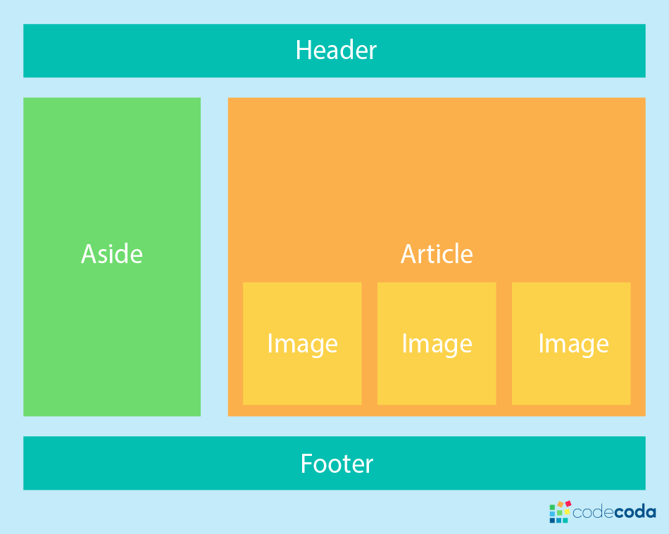
CSS Layout

At this point we’ve already looked at CSS fundamentals, how to style text, and how to style and manipulate the boxes that your content sits inside. Now it’s time to look at how to place your boxes in the right place in relation to the viewport, and one another. We have covered the necessary prerequisites so we can now dive deep into CSS layout, looking at different display settings, modern layout tools like flexbox, CSS grid, and positioning, and some of the legacy techniques you might still want to know about
Relative Positioning Relative is positioned relative to its normal position of the element.
div.relative {
position: relative;
left: 30px;
border: 3px solid #73AD21;
}
Controlling the Position of Elements
CSS has the following positioning schemes that allow you to control the layout of a page: normal flow, relative positioning, and absolute positioning .
You specify the positioning scheme using the position property in CSS. You can also float elements using the float property.
Normal flow Every block-level element appears on a new line, causing each item to appear lower down the page than the previous one. Even if you specify the width of the boxes and there is space for two elements to sit side-byside, they will not appear next to each other. This is the default behavior (unless you tell the browser to do something else).
Relative Positioning This moves an element from the position it would be in normal flow, shifting it to the top, right, bottom, or left of where it would have been placed. This does not affect the position of surrounding elements; they stay in the position they would be in in normal flow.
Absolute positioning This positions the element in relation to its containing element. It is taken out of normal flow, meaning that it does not affect the position of any surrounding elements (as they simply ignore the space it would have taken up). Absolutely positioned elements move as users scroll up and down the page.
Fixed Positioning This is a form of absolute positioning that positions the element in relation to the browser window, as opposed to the containing element. Elements with fixed positioning do not affect the position of surrounding elements and they do not move when the user scrolls up or down the page. Floating Elements
Floating an element allows you to take that element out of normal flow and position it to the far left or right of a containing box. The floated element becomes a block-level element around which other content can flow.
Screen Sizes Different users of your site will have screens that various sizes you should make your site compatible with every screen regadless of size
Screen Resolution Resolution refers to the number of dots a screen shows per inch. Some devices have a higher resolution than desktop computers and most operating systems allow users to adjust the resolution of their screens.
Fixed Width Layouts in this layout increases or decreases doesnt change the components of the web pages site
Advantages
Pixel values are accurate at controlling size and positioning of elements. The designer has far greater control over the appearance and position of items on the page than with liquid layouts. You can control the lengths of lines of text regardless of the size of the user’s window. The size of an image will always remain the same relative to the rest of the page.
Disadvantages
You can end up with big gaps around the edge of a page. If the user’s screen is a much higher resolution than the designer’s screen, the page can look smaller and text can be harder to read. If a user increases font sizes, text might not fit into the allotted spaces. The design works best on devices that have a site or resolution similar to that of desktop or laptop computers. The page will often take up more vertical space than a liquid layout with the same content